ALL CASE STUDIES

CONTACT
Leading a design exercise to reimagine an enterprise platform dashboard.
Lifion is a next-generation Human Capital Management (HCM) enterprise platform being developed by Automatic Data Processing (ADP). The platform allows companies to manage all of their human resources (HR) and payroll activities as well as build their own HR applications suited to their company's specific needs.
In the Spring of 2017, the platform had been in alpha-release for over a year, but the user dashboard was not working for our users or ADP's executive management.
Lifion's program director needed to illustrate the platform's progress to help drive executive buy-in for the program. The client management team was dealing with a lot of negative feedback from our existing alpha users and the sales team wanted a showpiece for new business. The core application team, the team I was on, was asked to reimagine the user dashboard, develop and launch within 2 months.
My role during the project:
One April afternoon during a weekly team check-in, the Lifion program director asked the core application team to design and build a new user dashboard. He wanted to show executive management that the Lifion platform could match the functionality of ADP's existing HCM platforms.
I knew we could do much better than matching existing systems, so during the meeting I convinced the program director to let us create a longer-term vision for the user dashboard while we tackled the short-term goal.

The user dashboard design as of April 2017 lacked visual hierarchy.
I started by talking to our business development team to find out what issues were being reported by our current alpha-phase users. I gathered anecdotal feedback from our client manager as well as direct written feedback from our users. I found the biggest problems to be:
I researched dashboard designs of our competitors and of parallel industries to get a full picture of design patterns. I was also able to tap into usability finding from the ADP research team to glean additional insights.

Competitor dashboards posted to boards for comparison.
Changes to the dashboard affected all the application teams at Lifion and I wanted to ensure we had buy-in from key stakeholders. I invited a cross-disciplinary group of designers, developers, product managers and the head of UX to participate in the design exercise to establish our strategy and sketch design concepts. I also invited our project director, head of new business, head of project management and client manager to weigh in on our findings.

Mapping user priorities and brainstorming ideas for the user dashboard during the design session.
I structured the day so that we would confirm our insights and strategy with stakeholders before moving onto sketching possible design solutions.
Sketches from our two ideation sessions.
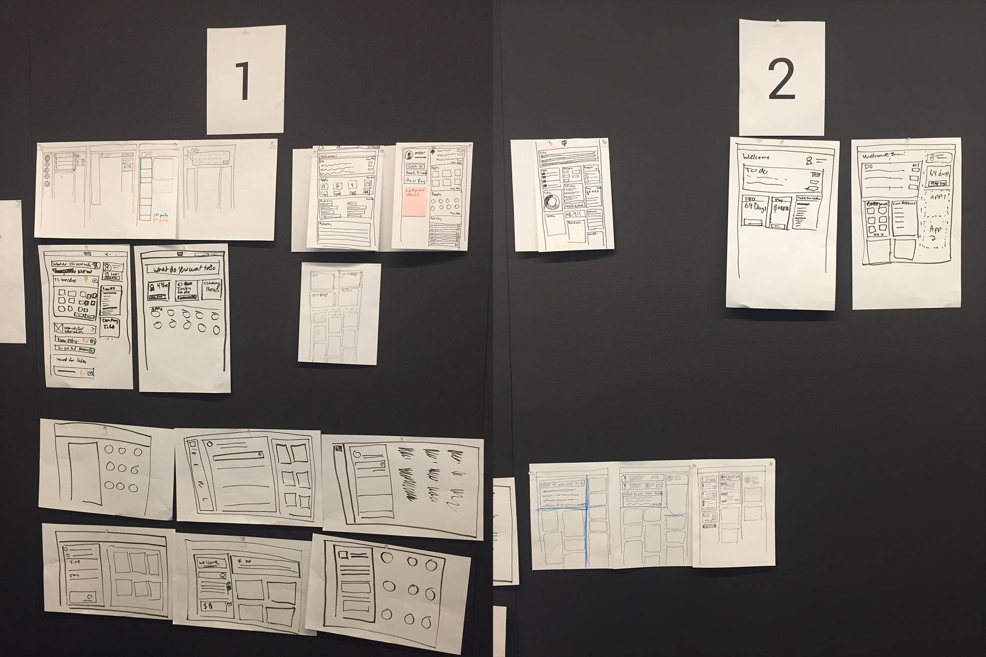
At the end of the design sprint, we agreed to ideate on three approaches. I worked on two approaches and another designer worked on the third.

Design ideations based on our sketches. I worked on designs #1 and #2.
I was able to validate our designs through a series of user interviews that our client manager facilitated. Overall our existing users liked the content to be prioritized and preferred the layouts of designs #2 and #3. I was able to take the user feedback and incorporate it into the designs before we took our findings to the program director.
Ultimately, he decided to move forward with design #1 due to quicker development time and hitting our launch date. He agreed that we should continue to explore the other design options so we could optimize the dashboard experience.
I moved forward with creating all the designs necessary for the developers to build the new page. Each module on the dashboard belonged to individual teams, so I worked with each of these teams to redesign their specific modules.

Final designs included all the different states of the modules on the user dashboard.
We were able to hit our target launch date and the work helped our program director secure the executive team's continued buy-in for the program. Initial reactions from our users were very positive and the new business team was happy they had a more engaging dashboard they could demo for potential clients.

Screenshot of final dashboard design.
